" height="18.488377445339474px" id="PmGl9mmDY" transform="translate(3 1)" width="15.443520457704416px"/><path d="M 7.321 19 C 6.201 19 5.19 18.847 4.287 18.539 C 3.43 18.254 2.643 17.795 1.975 17.192 C 1.332 16.592 0.831 15.858 0.508 15.043 C 0.158 14.125 -0.014 13.15 0.001 12.17 L 0.001 12.135 L 5.243 12.135 L 5.243 12.161 C 5.243 12.646 5.324 13.062 5.487 13.403 C 5.65 13.744 5.884 14.004 6.186 14.183 C 6.507 14.368 6.873 14.461 7.243 14.452 C 7.854 14.452 8.314 14.264 8.625 13.89 C 8.944 13.506 9.103 12.95 9.103 12.224 L 9.103 0 L 14.576 0 L 14.576 12.259 C 14.576 13.687 14.292 14.905 13.726 15.911 C 13.158 16.911 12.292 17.713 11.247 18.206 C 10.17 18.733 8.861 18.998 7.321 18.998 Z" fill="rgb(255, 255, 255)" height="19px" id="KYO9BColy" transform="translate(18.424 1)" width="14.576310124684067px"/></svg>)
Overview
Redesigned the Earner app’s demand experience to make real-time insights clearer, faster, and more actionable for drivers ⚡️

Problem
Drivers rely on the app to make high-stakes, time-sensitive decisions about where and when to earn. However, the existing experience lacked clarity in communicating demand signals, often resulting in confusion, missed opportunities, and inefficient movement across the map.
Scope
Driver app home, navigation, inbox, heatmap visual language, design system tokens
Outcome
Redesigned the experience to make demand signals more intuitive, actionable, and visually distinct.
Improved clarity of real-time demand through a structured visual system
Enabled faster decision-making with reduced cognitive load
Increased driver confidence in choosing where to move next
Created a scalable foundation for future demand-based features
Date:
Aug 2025 – Mar 2026
Team:
Product, Engineering, Data Science
Scope:
Logistics & Delivery
Reimagining the Driver Experience with Heatmap
Responsibilities
DISCOVERY & UXR
NORTH STAR VISIONING
CROSS FUNCTIONAL COLLABORATION
INTERACTION DESIGN
VISUAL DESIGN
PROTOTYPE & TESTING
DESIGN SYSTEM
STAKEHOLDER COMMUNICATION
LAUNCH & ITERATION
Challenges
Years of growth left the app feeling like it was working against drivers, not for them.
Uber's Driver app had scaled alongside a rapidly expanding platform but without a unifying design vision. Every new feature added another layer until the experience felt heavy, confusing, and stressful to use during a shift.
— Earner feedback, Crew session research
"It looks like dark grey clouds. I can't tell where
the money actually is."
— Driver interview, UXR discovery
"I have to tap four times just to see what I earned
today. I'm driving, I don't have time for that."
These weren't edge cases. Across ride, delivery, and shopping modes, earners described the same core frustration: the app demanded cognitive work during the moments it should have been doing the thinking for them.
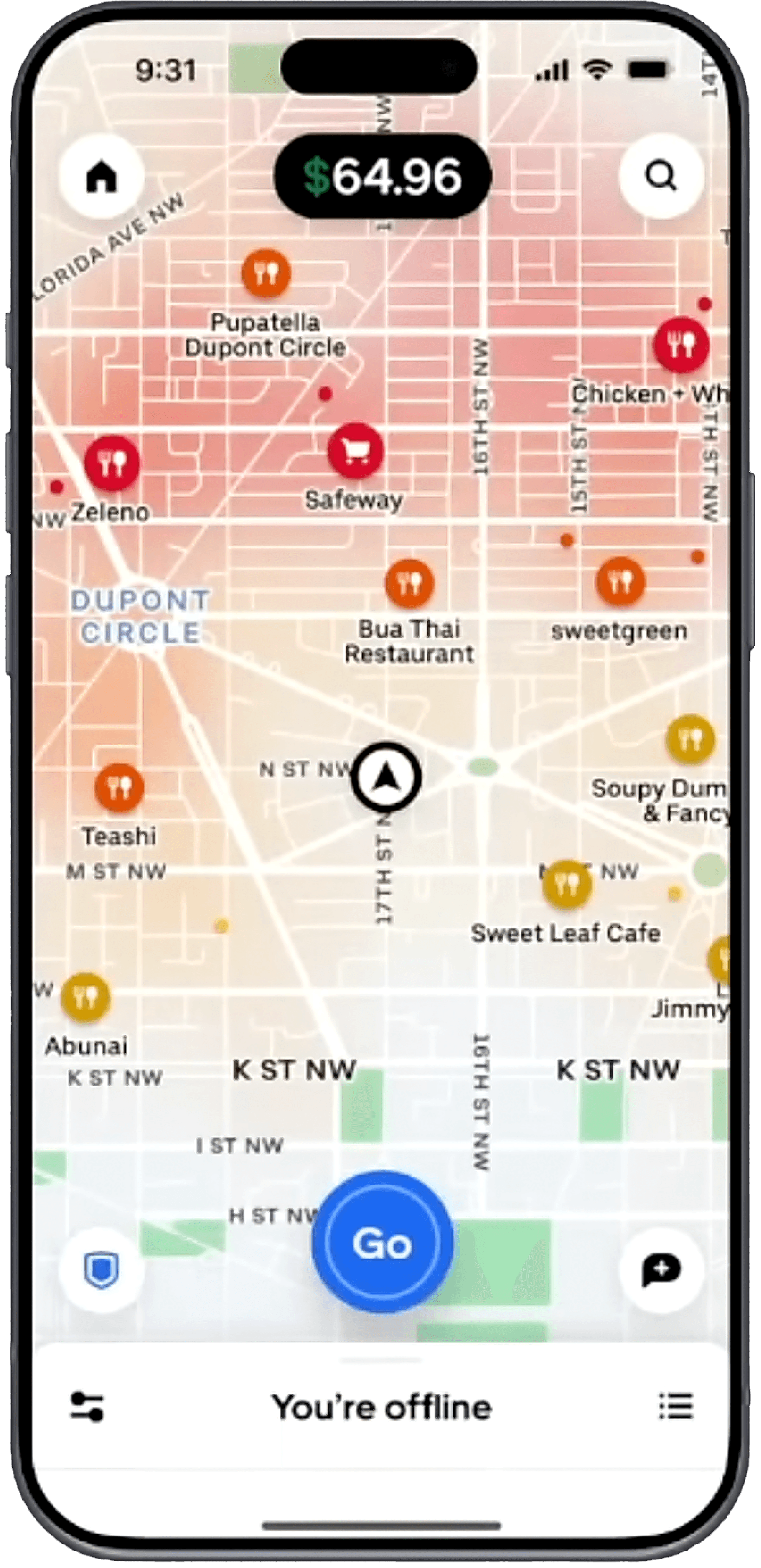
Heatmap signal failure
The old map's dark gradient couldn't communicate urgency or priority, earners were guessing where to go, not deciding.
Architecture bloat
The home, inbox, and menu had grown organically over years, burying critical actions behind discovery layers.
Low feature discoverability
Earners consistently missed tools like Destination Mode and earnings breakdowns, they existed but weren't surfaced at the right moment.
Global scale, local nuance
7M+ monthly earners across dozens of markets meant any redesign had to be culturally resilient and technically scalable.

Design Process
From messy complexity to a clear north star and back to complexity, intentionally.
Due to NDA, I can't disclose the specific details of each of my projects publicly. But the forefront started with months of listening, synthesizing, and building shared conviction before a single screen was drawn.
01
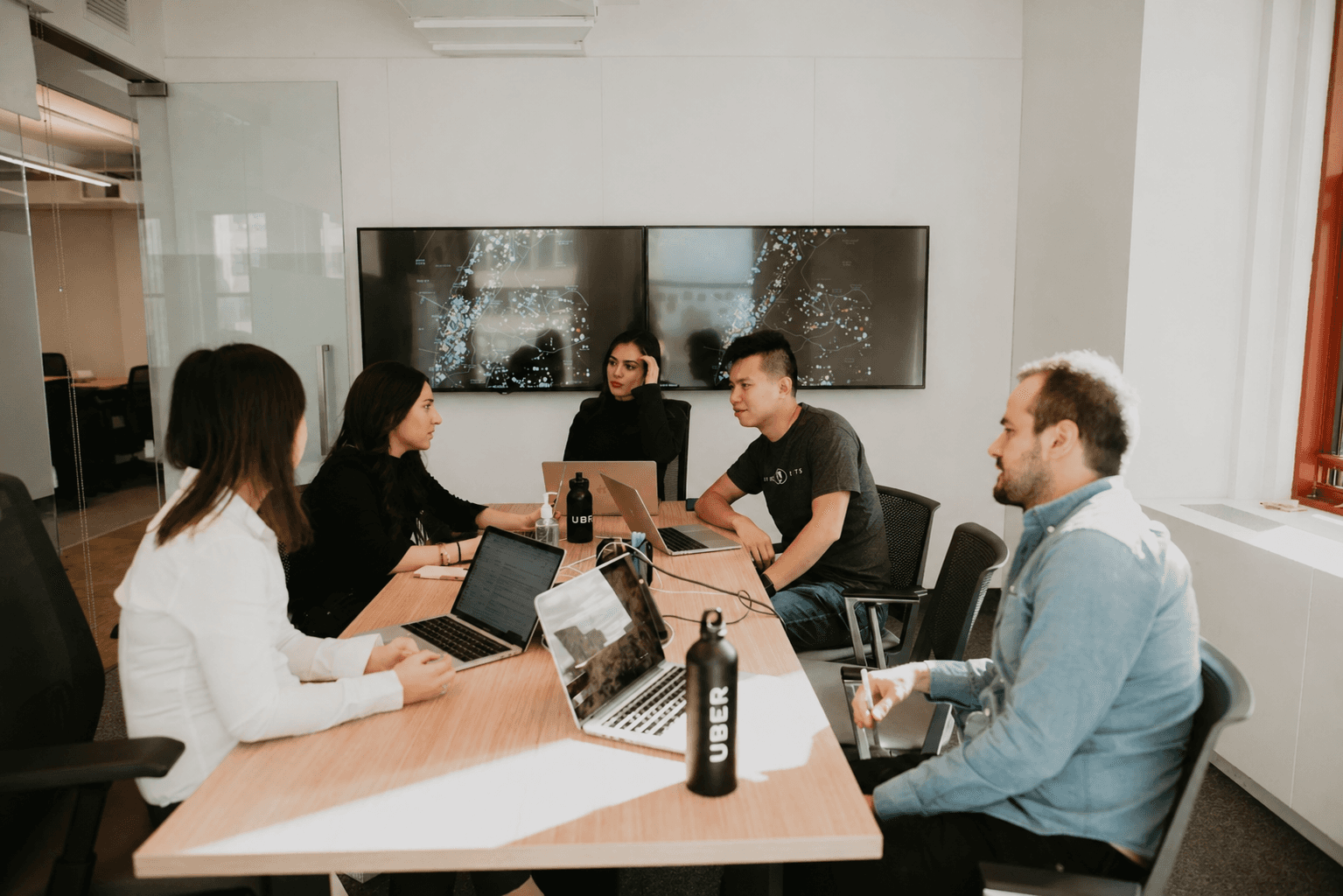
Discovery — Crew Sessions & Contextual Research
Partnered with UX Research to run driver Crew sessions, ride-alongs, and remote interviews across key markets. Captured over 60 sessions of earner feedback covering everything from emotional stress patterns to specific UI pain points.
Key output: A synthesized research repository surfacing 3 critical themes - cognitive overload, information timing failures, and trust signals on the heatmap.
02
North Star Visioning — Defining What "Better" Looks Like
Ran cross-functional workshops to align design, product, and engineering around a single vision: an app that does the thinking so earners can focus on driving. Created a north star prototype to pressure-test the vision before committing to scope.
Key output: A north star design brief accepted by leadership, establishing focus, flow, and trust as the three non-negotiable design pillars.
03
Heatmap Deep Dive — Visual Language for Real-Time Decisions
The heatmap was prioritized as the highest-impact single surface. Ran dedicated concept sprints exploring color semantics, iconography systems, and information hierarchy. Tested 4 major visual directions with earners across US, India, and Brazil markets.
Key output: Warm color spectrum mapped to predicted wait times (hotter = shorter waits), with purple surge icons; validated with global earner panels.
03
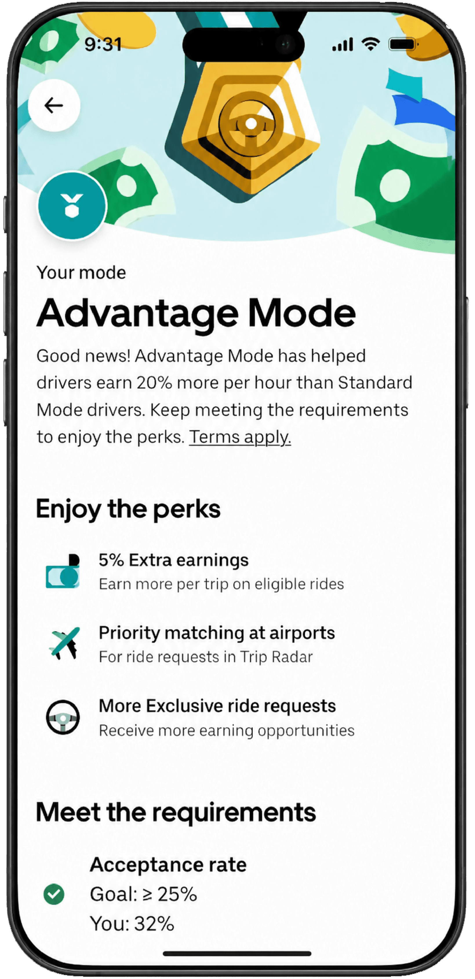
Architecture Redesign — Home, Inbox & Menu
Rebuilt the three core navigation surfaces from first principles. Prototyped 8+ structural directions in Figma and conducted moderated usability tests. Prioritized progressive disclosure — showing earners only what's relevant to their current earning state.
Key output: Restructured home with contextual guidance, prioritized inbox triage, and role-aware streamlined menu.
03
Cross-Org Alignment & Handoff
Partnered with engineering leads across 4 platform teams to ensure the new design language was feasible at scale. Created a comprehensive design spec library and contributed new tokens to Uber's Base design system for future earner surfaces.
Key output: Org-wide adoption of the new earner design patterns as the standard template for all future driver experiences.
04
Launch, Monitor & Iterate
Heatmap shipped fall 2025, featured by leadership at Only on Uber 2025. Full app redesign launched March 2026. Established a post-launch monitoring framework tracking feature discoverability, session quality, and earner satisfaction scores.
Key output: Sustained gains in discoverability and engagement post-launch; heatmap called “most effective design to date” by product.
CREW SESSIONS
focus groups
of 1:1 sessions
Global trips
Impact
Shipped to millions. Adopted org-wide.
The redesign improved core engagement and discoverability metrics, earned internal recognition as the model for all future earner experiences, and was featured by Uber leadership at the annual Only on Uber event.
Want to talk through the process?
If you'd like to read more than what's presented — the research, the alignment work, or the design decisions. Please reach out to me!


Behind the scenes
Some of the best design work happens in rooms full of people who care deeply about getting it right. Uber was that for me."
Got a project in mind? Tell me about it
Hi, I’m Priyam Joshi, a Designer who turns curiosity into meaningful experiences. I bridge human emotion, technology, and strategy to craft experiences that don’t just look good they work beautifully. As a UX Designer and Researcher, my passion lies in uncovering the “why” behind user behavior and transforming insights into inclusive, data-driven design systems that create real business impact.